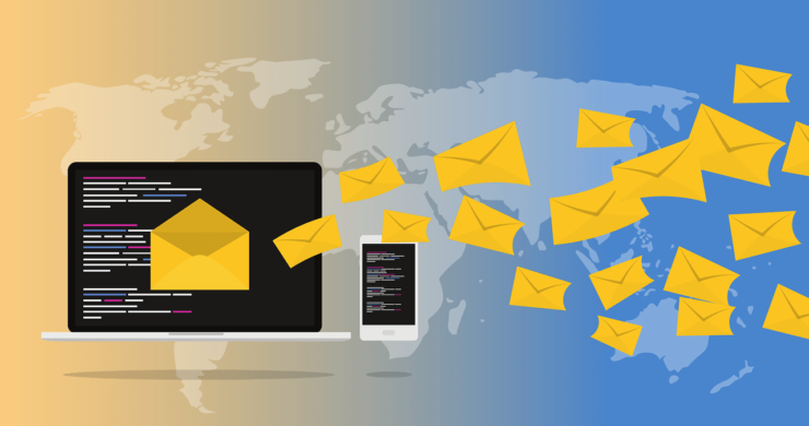
Your email list is your greatest asset!
HubSpot reports that 80% believe email marketing can increase sales and customer retention.
It’s essential to build a strong email list before you can use email marketing for reaching your audience. However, the way we request emails can often impact the user experience. Sometimes it can be so bad that users leave our site.
Pop-ups are the most popular method of building a list, right? Matthew Woodward conducted an experiment in order to study how pop-ups impact user behavior. He set up a popup to run in the 7th second of each visit. The results showed a 9.29% decrease in Pages/Visit, and a 10.20% decrease in Average Visit Duration.
The pop-up stopped users from reading the content as they were starting to read it. People don’t like pop-ups, especially when they appear to be an obstacle.
There are ways to ask for emails more politely
The key is to not disrupt their consumption of your content. Just give them time, don’t interrupt them, and don’t be pushy.
1. Add a pop-up at the end of your content
If you aren’t getting enough email leads, it could be that your website isn’t asking for emails at the end.
After reading your content, most visitors will decide whether they want to subscribe. You can ask them to subscribe right away by triggering a popup once they reach the bottom. It converts well and sometimes converts users who weren’t ready to subscribe in the first place.
2. Initiate a pop-up when a user signals exit-intent
Do you want to increase your subscribers in five minutes or less? Just arrange for a popup to appear when the user signals that they are leaving.
Exit-intent, a relatively new technology, is used to determine when a user will leave a site. It works well and has been integrated into most list-building tools such as OptiMonster and many others.
Be sure you create an exit-intent popup with a compelling invitation to subscribe.
3. After a Page Scrolls, slide-in or slide-up a request
Slide in a request for subscribers when someone scrolls down some percentage of the page. This is one of the most gentle ways to capture emails. This type of entrance is gentle, but it’s very eye-catching and works well.
Slide-in subscribers often convert at a higher rate than regular pop-ups. You may find that sliding in after 80% is the best converting range. There are several easy to use Wodpress plugins that support this.
4. Sticky Top Bar
A simple, visible bar could be displayed that is at the top of your screen. It should scroll with the page so that it remains in the user’s view all the time. It will get noticed and convert well.
The message we use on the bar is usually a call-to-action message, however, it can also be used as an invitation to subscribe.
Hello Bar offers top-notch bar services. It works well and has already acquired many reputable customers “DIYthemes” has one of them. Hello Bar has 1,180 additional email subscribers in 30 days of using Hello Bar.
5. Offer a Content Upgrade
As a reward for subscribing, a content upgrade is a magnet that offers content with more value.
Let’s say you plan to write a post titled “Top 3 Ways To Get Organic Traffic.” Also, you have a PDF called “30 Different Sources for Getting More Traffic.” All you have to do is give readers the chance to download the PDF by opting in.
Consider offering upgrades to your content as subscribing incentives and see if it improves conversion.
6. Use a homepage “feature box”
The homepage is often the most authoritative and visited page of a website. It can be leveraged to gain subscribers even before your visitor consumes any content with a strong enough incentive to subscribe. See what Thesis did with their feature box.
7. Add a sidebar
Sidebars provide additional navigation value for users. It is usually found on all blog pages and is a good place for a subscription form.
The best place to put the form is at the top of your sidebar. This can result in a 26% increase of subscribers.
8. Create a dedicated landing page
Your conversion rate can be increased by creating a landing page specifically for email marketing.
Optimize your landing page to encourage email subscriptions. These tips will help you make your landing page a high-converting one.
- Offer something that is appealing to visitors.
- It can be designed with contrasting colors and the right placement.
- To gain trust, include reviews and social proofs.
- Decorate it with images and insights that will draw attention.
- Make sure the subscribe button is visible. Use a bright button such as red, green, and blue.
Example: Adam Connell created a beautiful landing page that featured an attractive offer, colors and images as well as testimonials.
9. Place a Subscribe Box following your Content
This method is identical to the “Present a pop-up at the end of your content” method. The only difference is that it won’t pop open. It will remain in place just like a normal subscribe button right underneath the content. This might not be as eye-catching as a pop-up, but it’s faster to implement and still converts well.
10. Submit a Survey
Surveys can be used to collect insights and votes from users. A survey can be used to build a powerful list in just a few tweaks.
Qualaroo allows you to create a survey subscriber form. The form should be in the bottom corner of your screen. It will undoubtedly increase your conversion rate.
Selection, timing, and behavior
Do more with less! When I think about the three points of selection, timing, behavior, that’s what comes to mind.
Selection: What method is best for you? Because all websites are different, there are no easy recommendations. Each website is different. This is the best way to do it.
- Perform a heatmap test.
- Find the areas that have the most clicks.
- Pick the best 2 or 3 methods.
Timing Subscribing material should not appear before 60 seconds have passed. You will experience a significant drop-off in conversion rate if they appear before 60 seconds. If you wait too long you will lose a lot of visitors. The best timing is between 60 and 60 seconds, or just a little after that period.
Behavior Why should behavior be controlled? Here are some reasons:
- Stop irritating visitors
- Stop people leaving your site
- Stop losing conversions
You can use cache to prevent the same person from seeing subscribing material again and again. The cache can be set to expire in 15-30 days so that visitors who have seen the materials once will not see them again within the same time period. Some of the more common forms, such as sidebars, home gates, top bars, etc., can still be displayed.
Your turn!
List building is about understanding your audience and looking for ways to capture their emails.
I recommend that you choose the right method for your users. Be sure to test!


